
WEB: Whole foods market on amazon
Our customers deeply value the in-store shopping experience at Whole Foods, but our online ordering interface faded into Amazon templates. With Amazon’s approval, I started working with designers to push traditional Amazon wireframes. Now each month, I create unique shoppable landing pages that tell a story for our customers through photography, copy and themed shovelers. I work on the content design in Figma.
Any copy on amazon.com/wholefoodsmarket will be my work, as well as other spaces where Whole Foods Market appears on Amazon.
2021 HOLIDAY DESTINATIONS
Our 2021 Thanksgiving Order Ahead hub was the first holiday page that broke the traditional mold, and it had an average click through rate of 26.2% in November. Our “explore the menu” placement driving to the estore had a click through rate of 67.9%.


DIETARY PREFERENCES
The digital space is a great way to design shopping experiences that our customers can’t get in-store, such as shopping by a preferred diet. After being given the featured products for each landing page, I wrote tips, ideas and recipe inclusions our customers can browse while they shop. These pages are launching next month.


OTHER UNIQUE WAYS TO SHOP
Each month can include in-season products, special sales or PR activations, like beauty trends.


UX/UI: TECHNOLOGY INTEGRATION
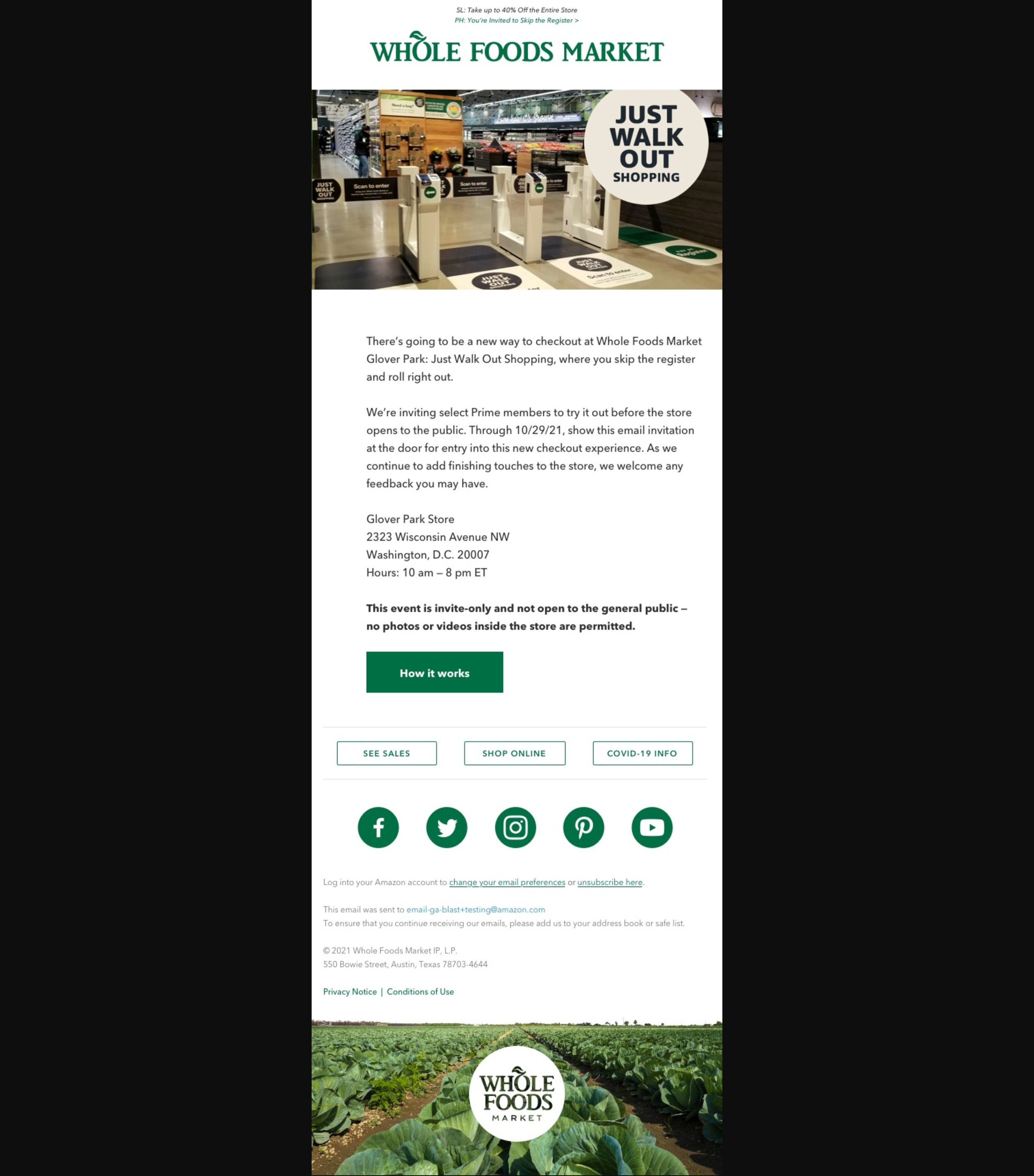
In 2021, Whole Foods started incorporating new Amazon technology into the shopping and checkout process, such as Just Walk Out. While customers of Amazon Go stores are eager to use new tech, most of our customers are neutral, and even hesitant, about incorporating different ways of shopping.
After being briefed on launch details, I write a variety of digital and in-store assets to introduce the new technology. While concisely explaining “how it works” in our voice and tone is important, it’s also vital to convey how the tech can enhance the shopping experience.
The majority of these examples are still in Beta testing in a select number of stores, with larger roll outs coming soon.
JUST WALK OUT SHOPPING
This is the first opportunity for our customers to skip the checkout register by scanning in and out of a special gate. Breaking out the instructions into three steps was a way to help our customers feel like the tech was manageable to learn and try out.
The signage is in Beta testing. Additional deliverables include email campaigns and the Just Walk Out landing page.


AMAZON ONE AND IN-STORE CODE
We launched two cardless payment methods within a span of a month. The In-store Code was launched exclusively in the app, while Amazon One required screen and kiosk placements. Creating a distinct benefit line for each was a strategy to help the customer differentiate the two methods. While Amazon One is a more intentional way to use cardless pay, In-store Code populates as a convenience for customers already in the app using their Prime discount code.


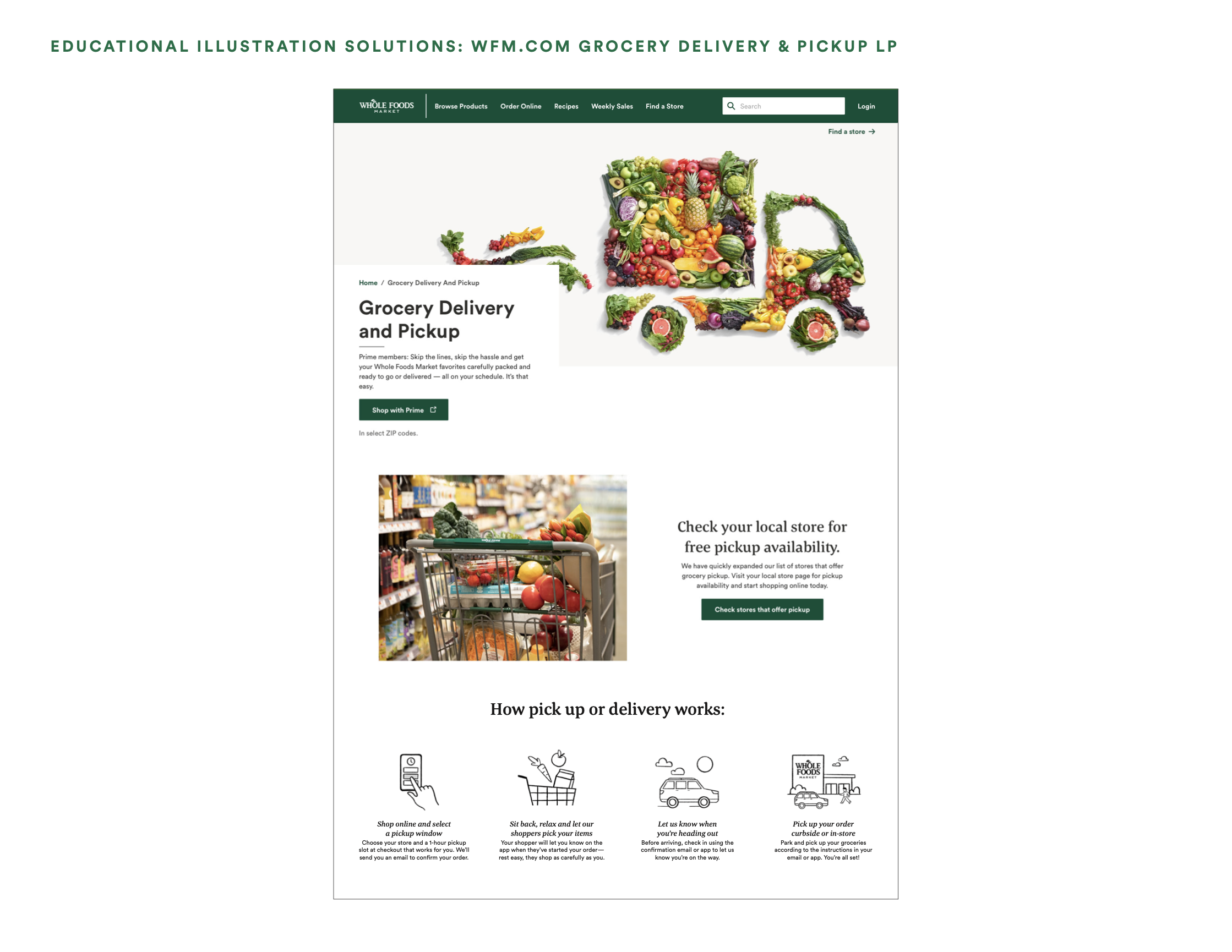
GROCERY PICKUP
The number one barrier to pickup customer retention is confusion around the process. To help visually explain, I wrote an iconography toolkit and worked with our UX designers to incorporate them into our pickup user flow (both on web and app). Final illustrations are in the works.


ARTICLE CONTENT AND WIREFRAMES
I write and wireframe my own articles for our site content. Additionally, I am a primary manager of our content management system.


EXTRA EXAMPLES
Additional assets I write include social, paid media, push notifications and app updates.


